PulseAugur
实时 13:10:27
English(EN) # AI # fonts "AI Has Come for Serif Fonts AI companies are using serifs to project humanity. Critics are calling it 'tasteslop.' AS PUBLIC BACKLASH to the seemi

AI 公司在公众强烈反对声中采用衬线字体以显得人性化

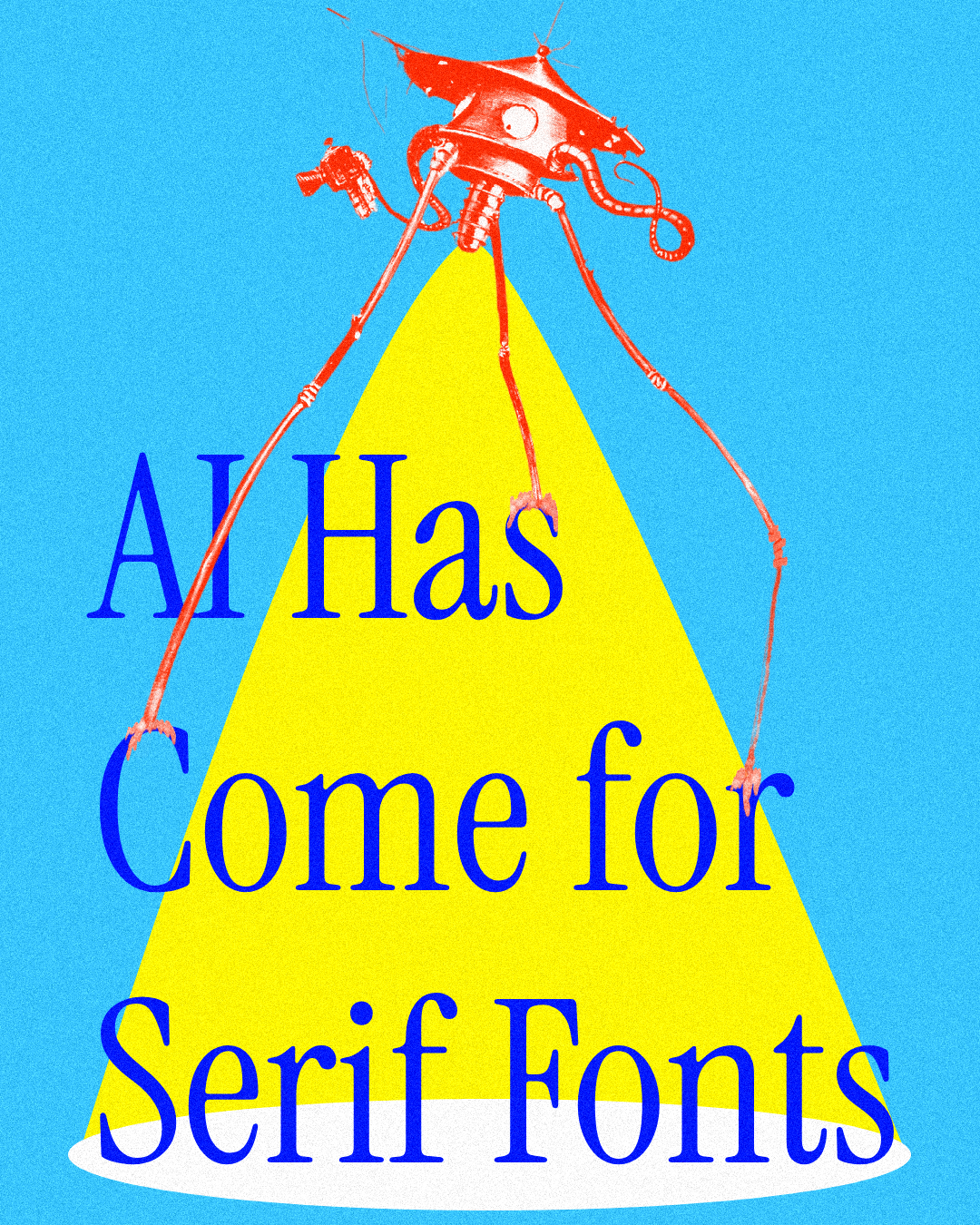
AI 公司越来越多地在其品牌设计中使用衬线字体,以显得更人性化和值得信赖,从而摆脱无衬线字体那种冰冷、计算机化的感觉。这一趋势是对公众对人工智能无处不在的担忧所作出的回应。然而,批评者认为这种审美选择是“品味垃圾”,觉得它可预测且陈腐。 AI

影响 AI 公司正利用衬线字体来展现人性化和可信赖感,这一趋势被批评者称为“品味垃圾”。

排序理由 该集群讨论了一篇关于人工智能公司品牌趋势的观点文章,而不是直接的人工智能发布或开发。

在 Mastodon — fosstodon.org 阅读 →

AI 生成摘要 · Google Gemini · 来自 2 个来源。 我们如何撰写摘要 →

AI 公司在公众强烈反对声中采用衬线字体以显得人性化

报道来源 [2]

  1. Mastodon — fosstodon.org TIER_1 English(EN) · [email protected] ·

    🔴 AI Has Come for Serif Fonts by John Semley @johnsemley3000.bsky.social at @ [email protected] @ [email protected] AI companies are using serifs to project

    🔴 AI Has Come for Serif Fonts by John Semley @johnsemley3000.bsky.social at @ [email protected] @ [email protected] AI companies are using serifs to project humanity. Critics are calling it “tasteslop.” # AI # serif # Typography https://www. wired.com/story/ai-has-come-fo r-se…

  2. Mastodon — fosstodon.org TIER_1 English(EN) · [email protected] ·

    # AI # fonts "AI Has Come for Serif Fonts AI companies are using serifs to project humanity. Critics are calling it 'tasteslop.' AS PUBLIC BACKLASH to the seemi

    # AI # fonts "AI Has Come for Serif Fonts AI companies are using serifs to project humanity. Critics are calling it 'tasteslop.' AS PUBLIC BACKLASH to the seeming omnipresence of artificial intelligence intensifies, the collective quest to weed out—and reject—telltale signs of it…